A note to self
In the emissions shiny app from Saturday there is the option to remove some of the sectors or fuels from the graph. Unfortunately when you did this the graphs originally failed to remember the colours assigned to the lines in the previous version and reassigned them among the remaining ones. This was a problem, but one I managed to fix. For future self-reference, here is a tutorial how to do it.
For example, here is the same problem but with a
scatter plot with the famous mpg
data-set:
library(ggplot2)
library(RColorBrewer)
data(mpg)
kable(tail(mpg))
ggplot(mpg, aes(cty, hwy, color=fl)) + geom_point(size = 2.5) +
  scale_color_brewer(type="qual", palette = "Paired") + theme_linedraw() +
  ggtitle("cty by hwy by fuel type")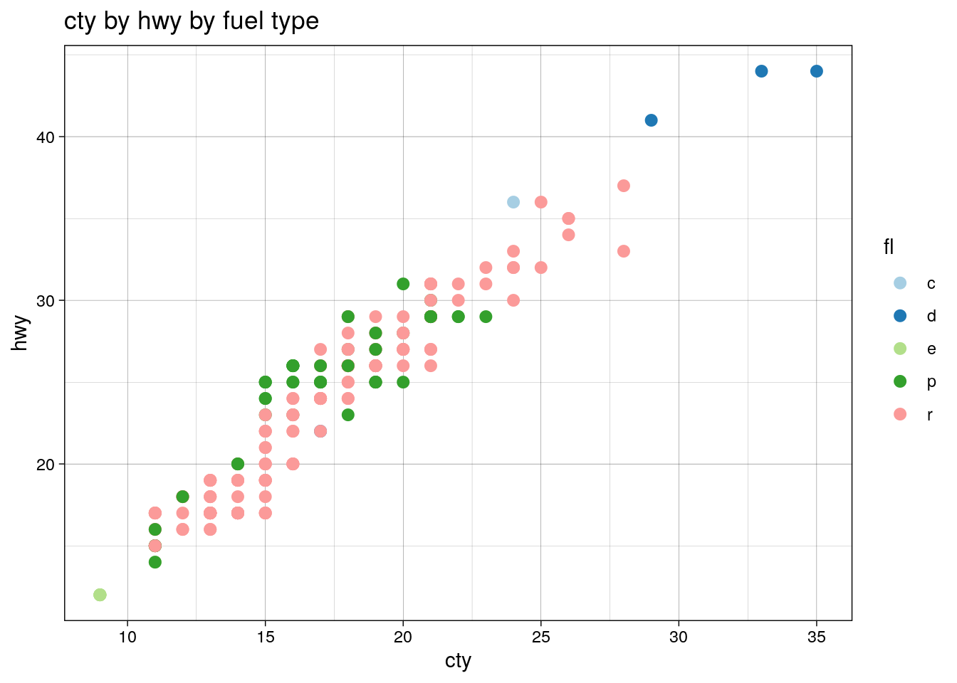
Note that there is a fair amount of over plotting
here, but that’s not important. cty is the
mpg in the city; hwy is for highways; and
fl is the fuel type: CNG,
diesel, ethanol,
premium, and
regular.
Suppose we remove the premium fuel cars—the green dots—from the data set:
library(dplyr)
mpg <- filter(mpg, fl != "p")
ggplot(mpg, aes(cty, hwy, color=fl)) + geom_point(size=2.5) +
  scale_color_brewer(type="qual", palette = "Paired") + theme_linedraw() +
  ggtitle("cty by hwy by fuel type, removing premium fuel")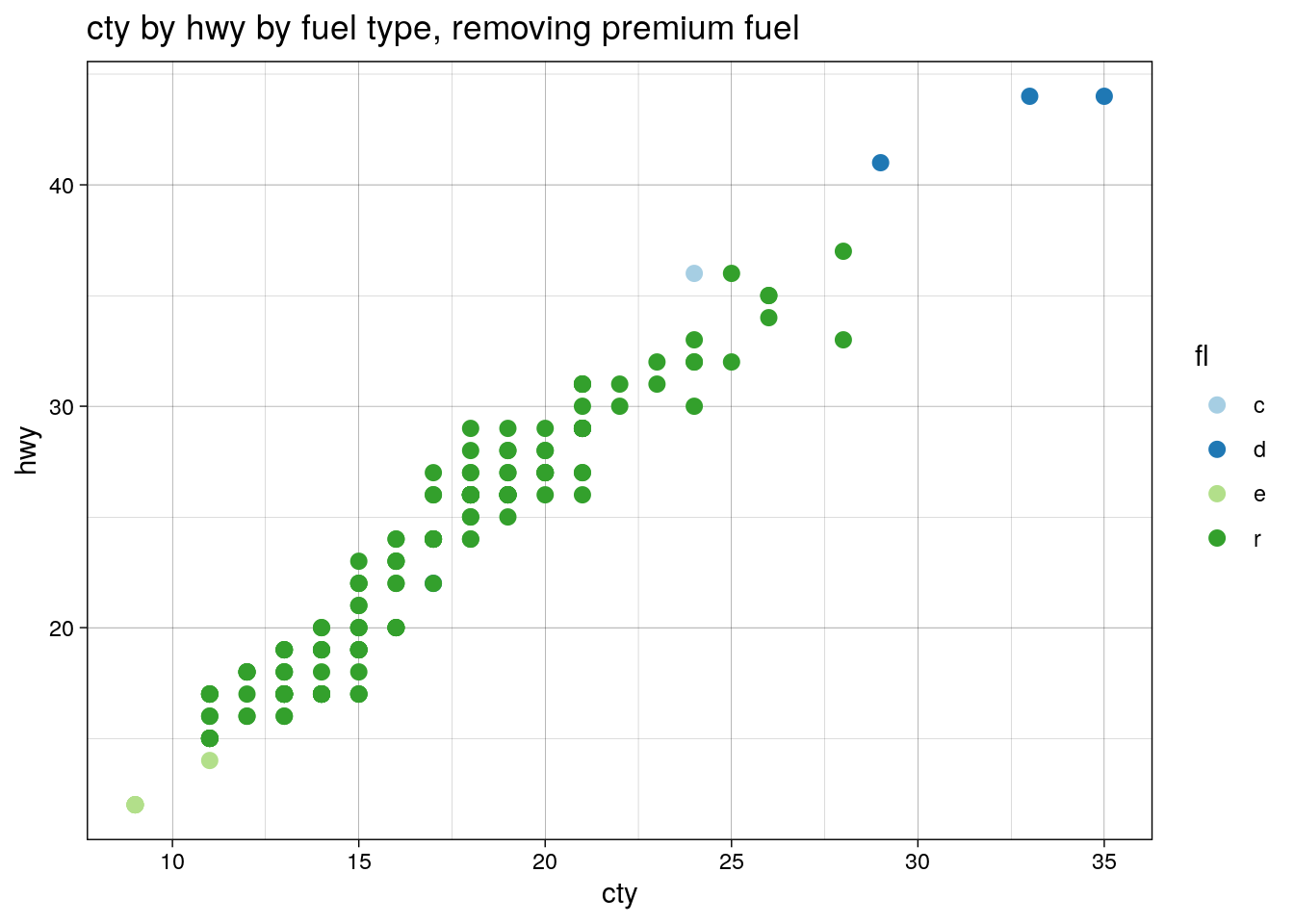
Premium was green, but now regular is. This is a problem, but one with a solution: manual specification of colours from the palette. Lets start again:
data(mpg) # reset dataset
fl.types <- unique(mpg$fl)
fl.cols <- brewer.pal(length(fl.types), "Paired")
names(fl.cols) <- fl.types
There are several ways to do this, but in the course
of writing this post I actually discovered that the way
I was doing it in the emissions app was not ideal. In
that case I was creating fl.cols as a data
frame, left_joining it to the dataset, and
then applying the colours with
scale_color_manual(values=unique(mpg$cols)).
This works fine in the app, but relies on the hidden
assumption of the plotting order: because the emissions
algorithm involves a tidy::gather it has
it’s equivalent of the fl column as a
factor, with the same order of its levels as the colours
are assigned, this is not a problem. Unfortunately this
is does not work immediately with the mpg
dataset we have here, something which caused me no end
of trouble.
Instead, fl.cols is a named vector, with
the names corresponding to the fl levels.
We can make the original graph in the new way like
so:
ggplot(mpg, aes(cty, hwy, color=fl)) + geom_point(size = 2.5) +
  scale_color_manual(values=fl.cols) + theme_linedraw() +
  ggtitle("cty by hwy by fuel type, v2")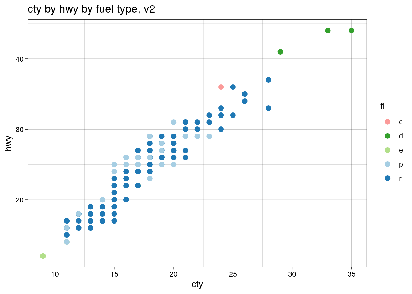
…except this has a problem: the colours are in a new
order, and for the same order-of-plotting reason as
before. This is because
scale_color_brewer() was assigning based on
alphabetical order, while we assigned by order of
appearence in unique(). This is easily
fixed:
names(fl.cols) <- sort(fl.types)
ggplot(mpg, aes(cty, hwy, color=fl)) + geom_point(size = 2.5) +
  scale_color_manual(values=fl.cols) + theme_linedraw() +
  ggtitle("cty by hwy by fuel type, v2.1")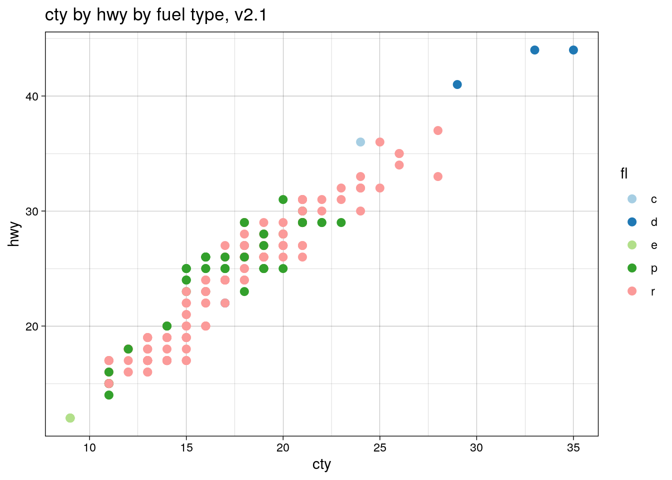
But now, finally, filtering the mpg dataset will produce the colours we want, in the order we want!
mpg <- filter(mpg, fl != "p")
ggplot(mpg, aes(cty, hwy, color=fl)) + geom_point(size=2.5) +
  scale_color_manual(values=fl.cols) + theme_linedraw() +
  ggtitle("cty by hwy by fuel type, removing premium fuel, v2")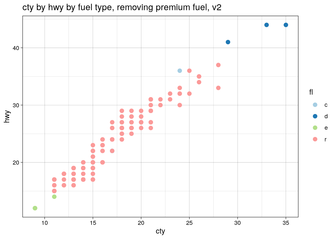
Voilà!