Graphing how people will vote in a strange year
Advance voting for the 2020 New Zealand General Election (And Referenda) began on the 3rd of October and will continue until the day before the election itself, which happens on Saturday the 17th. That means it’s time for the return of one of my favourite graphs, the Electoral Commission’s how-many-people-voted-yesterday graph, which you can see on their website but which currently looks something like this:
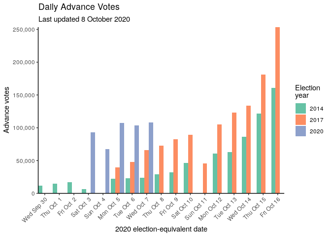
Typically it seems that more people early vote the closer they come to the day of the election, whether because they’ve made up their mind or because they feel it’s more urgent, and that more people have voted early each election. The EC only includes the previous two elections in these graphs, but in fact it’s a trend that’s been going on for a while:
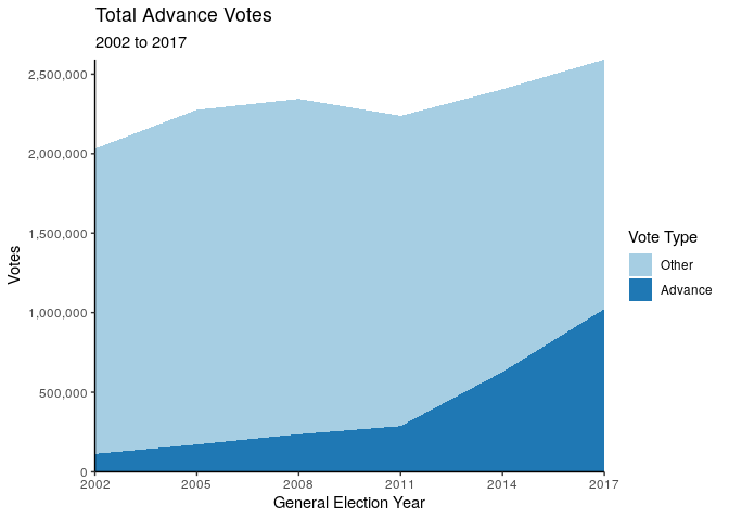
The number of advance votes really ticked up in 2014, but it has increased year-on-year (or rather, election-on-election) ever since 2002, the first election that I can find that had early voting, even though turnout overall has been less consistent. You can find data on past elections from electionresults.govt.nz, but I’ve made a csv of my scrapings.
The cause of the increased popularity of advance voting in the recent past is unclear, but this year it’s being explicitly encouraged to promote covid-related physical distancing. This has a lot of people wondering what effect it will have on the results, and on how the results will come in on election night.
My opinion is: it won’t.
Advance votes (but not special votes, which can also be made early but which are counted later, and which I have included under ‘Other’ above) are counted starting in the morning of the day of the election, and so when the first results of the evening are released they are mostly made out of these votes. As the counting continues these results are updated and eventually converge on the final results, although the final final results don’t actually come out on the night.
The distribution of advance votes does not match the true distribution because advance votes are a non-representative subset of all votes. Some parties do seem to receive more of their votes as advance votes, but this effect isn’t very large:
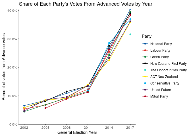
The proportion of votes made in advance has increased for every party (I’ve arbitrarily removed the parties below a certain average vote share), but the within-election spread is relatively low. At most, I might be able to say that the National Party consistently gets a slightly larger proportion of its votes from the advance votes, and so can expect to under-preform their results as given at that first 8pm preliminary release.
However the effect of increasing numbers of advance votes is to reduce that effect. I won’t go into how MMP turns party votes (and candidate votes, which I haven’t mentioned here because they’re not that crucial) into the total number of seats allocated to each party in the House of Representatives, but the Electoral Commission data is neat because it includes the seat distribution that would result if the advance votes were the only votes. This then is the difference in seats allocated to each party under each scenario:
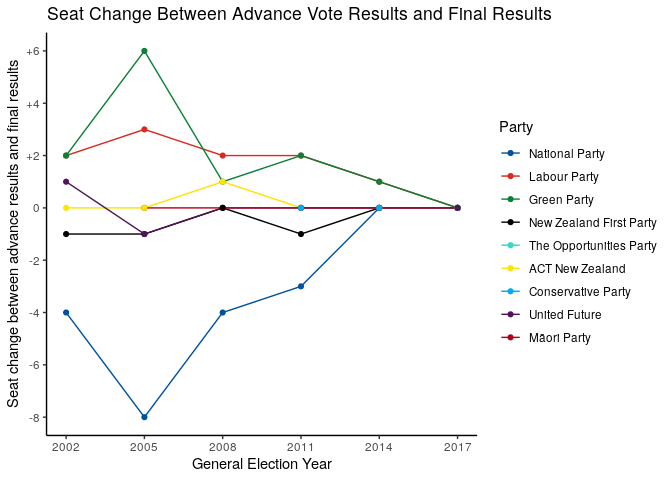
As suspected above, the National Party have indeed tended to under-perform their advance results, and this has translated into their seat count. However regardless of party this effect has diminished as the number of advance votes have increased: as more and more votes are cast in advance, the advance votes become less a subset and more the set. The 2017 advance results actually predicted the overall seat numbers exactly, although not individual electorate MPs.1
The number of advance votes will only be higher this year, and so those first results are almost certainly going to closely match the final ones and not deviate wildly as you might first expect. This will have the effect of making the night a lot less suspenseful than it was only a few cycles ago, but I guess that’s the price of efficiency.
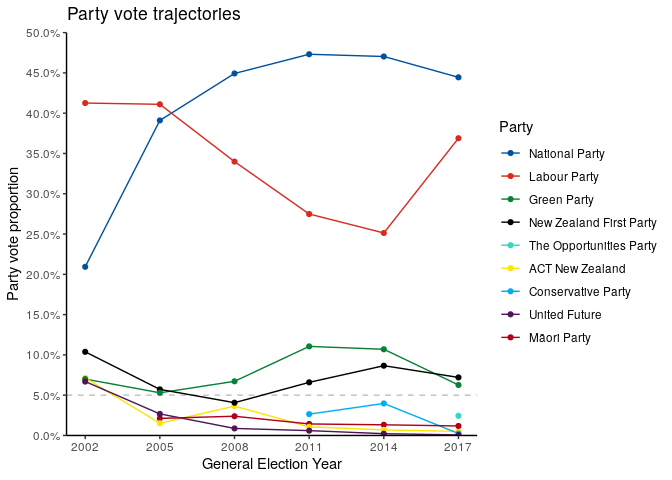
While I’m making graphs of this data, here’s the vote percentage trajectory for the last few elections for no real reason:
You can find the data and code I used to create these graphs on my gitea, or on github if that’s where you prefer to look at things. Now go vote!
Although if I remember correctly the results at the end of the night were actually a seat or two different from the advance results, but the later counting of the special votes swung this the other way.↩︎